Pages

Saturday, October 19, 2019

Create a Custom Control with Xamarin.Forms

  The process of building UI elements requires, at some point, some customizations to give the unique feel and look to the application and to extend the functionality of existing controls. Whether the customization is just overriding the default TextColor of the Entry control, or creating a brand new control with new look and behavior, building custom controls can provide the simple solution to achieve that, without the need of custom renderers.

Create a Custom ToggleBar Control

The 
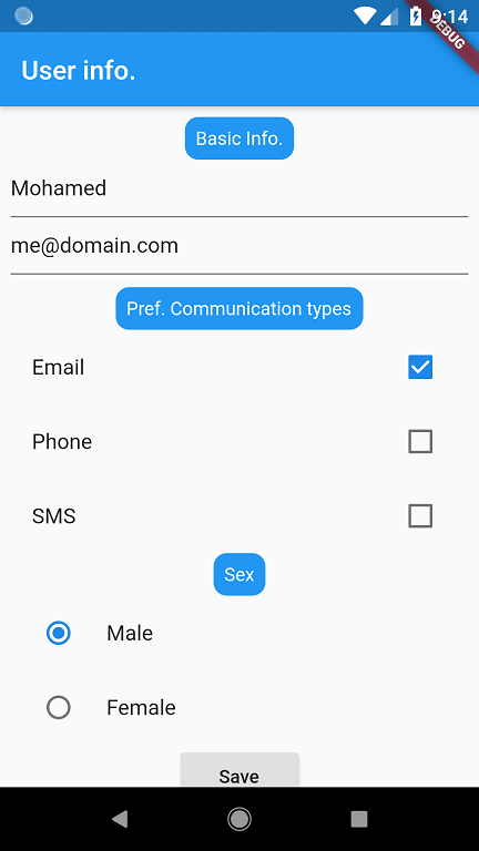
ToggleBar control can be used to show some options that the user can choose from, for example a filtering mechanism (similar to a group of radio buttons), or a light-weight tabbed control..etc, see the screenshot below (should look the same on iOS):

The behavior of the control is as follows:
  1. Every button in the control has a selected state and an unselected state determined by the IsSelected bindable property.
  2. The states are visually distinguished through the SelectedColor and the UnselectedColor bindable properties.
  3. The selected items can be obtained through the bindable property SelectedItems.
  4. The control supports multi-selection (that’s why it’s SelectedItems not SelectedItem) by setting the IsMultiSelect bindable property to true (defaults to false).
Bindable properties are the foundation of custom controls (For more information about Xamarin.Forms bindable properties, see Xamarin.Forms Bindable Properties).
Every button inside the ToggleBar control is a custom control by itself. This article will guide you through creating the ToggleButton control and the same concepts can be leveraged in the ToggleBar control (see the complete sample).
The process for creating custom controls is as follows:
  1. Create a subclass of the view you want to extend or modify.
  2. Alter the functionality of the subclass by overriding the default values of the base class’s bindable properties and/or create new bindable properties that will interact with user actions.
  3. Initialize the custom control.
  4. Process inputs in run-time through the propertyChanged delegate of the newly added bindable properties.

Create a Subclass of the View you Want to Extend

Most of custom controls are hosted in a ContentView as it is the simplest container and doesn't expose special properties (like Orientation of the StackLayout that can interfer with the the control behavior). Create a subclass from ContentView in the .NET Standard library project, name it ToggleButton, it holds the StackLayout that has two children: Label and BoxView, the following diagram illustrates the control outline:

When the StackLayout is tapped, the selection state is mutated. The visual state is defined by the TextColor property of the Label and the Color property of the BoxView.

Alter the Functionality of the Subclass:

Create the bindable properties: IsSelectedSelectedColorUnselectedColorTextFontFamily and FontSize. This is the SelectedColor property along with the BindableProperty backing field:

public static readonly BindableProperty SelectedColorProperty = BindableProperty.Create(nameof(SelectedColor), typeof(Color), typeof(ToggleButton),
defaultValue: Color.Default);

 public Color SelectedColor
 {
     get { return (Color)GetValue(SelectedColorProperty); }
     set { SetValue(SelectedColorProperty, value); }
 }


Gemoji image for :bulb A bindable property is a special type of property, where the property's value is tracked by the Xamarin.Forms property system. The purpose of bindable properties is to provide a property system that supports data binding, styles, templates, and values set through parent-child relationships. The process of creating a bindable property is as follows:
  1. Create a BindableProperty instance with one of the BindableProperty.Create method overloads.
  2. Define property accessors for the BindableProperty instance.
For more information about Xamarin.Forms bindable properties, see Xamarin.Forms Bindable Properties
Gemoji image for :bulb Custom bindable properties in custom controls can be categorized into two types:
  1. Bindable properties that are passed down to the built-in bindable properties of child elements, like Text bindable property of the ToggleButton custom control, that is passed down to the Text bindable property of the Label control.
  2. Bindable properties that are specific to the custom control itself and not owned exclusively by any of the child elements, like the IsSelected bindable property. The more behavioral customization required to the custom control, the more of these bindable properties are needed.

Initializing the custom control

In the constructor of the ToggleButton class, initialize the inner controls and create the bindings between the new properties of the custom control and the properties of the inner controls (i.e., the StackLayout, the Label and the BoxView):
public ToggleButton()
{
    verticalStack = new StackLayout
    {
        Spacing = 0,
        HorizontalOptions = LayoutOptions.FillAndExpand
    };
    label = new Label
    {
        HorizontalTextAlignment = TextAlignment.Center,
        VerticalTextAlignment = TextAlignment.Center,
        VerticalOptions = LayoutOptions.CenterAndExpand,
        Margin = new Thickness(5)
    };
    boxView = new BoxView
    {
        VerticalOptions = LayoutOptions.End,
        HeightRequest = HeightRequest > 0 ? HeightRequest / 10d : 2
    };

    label.SetBinding(Label.TextColorProperty, new Binding(nameof(UnselectedColor), source: this));
    label.SetBinding(Label.TextProperty, new Binding(nameof(Text), source: this));
    label.SetBinding(Label.BackgroundColorProperty, new Binding(nameof(BackgroundColor), source: verticalStack));
    label.SetBinding(Label.WidthRequestProperty, new Binding(nameof(WidthRequest), source: verticalStack));
    label.SetBinding(Label.HeightRequestProperty, new Binding(nameof(HeightRequest), source: verticalStack));
    label.SetBinding(Label.FontFamilyProperty, new Binding(nameof(FontFamily), source: this));
    label.SetBinding(Label.FontSizeProperty, new Binding(nameof(FontSize), source: this));
    boxView.SetBinding(BoxView.BackgroundColorProperty, new Binding(nameof(BackgroundColor), source: verticalStack));
    verticalStack.GestureRecognizers.Add(new TapGestureRecognizer()
    {
        Command = new Command(() =>
        {
            IsSelected = !IsSelected;
            SelectionChanged?.Invoke(this, IsSelected);
        })
    });

    verticalStack.Children.Add(label);
    verticalStack.Children.Add(boxView);
    Content = verticalStack;
}

The constructor initializes the control properties, for example the TextColor property of the Label is bound to the UnselectedColor property of the custom control beacause the control is rendered in unselected state if IsSelected is not set, similarly, the BoxView's Color property is bound to the value of the BackgroundColor of the StackLayout to hide it, it only gets highlited with SelectedColor value when the control is selected. Setting the WidthRequest and HeightRequest for the Label and HeightRequest for the BoxView ensures they scale with the StackLayout size.
TapGestureRecognizer is added to the StackLayout’s GestureRecognizers collection to mutate the selection state of the ToggleButton when the StackLayout is tapped. The TapGestureRecognizer provides two approaches for handling the tap action: by the Tapped event, or by the Command property. For more information about the tap gesture recognizer, see Adding a tap gesture recognizer. When the value of IsSelected propery changes, the propertyChanged delegate handles the visual state of the control (see next section).
Create SelectionChanged event that gets invoked when the StackLayout is tapped, to notify consumers of the ToggleButton (e.g. the ToggleBar control) when selection changes:
public event EventHandler<bool> SelectionChanged;

Process Inputs in run-time Through the propertyChanged Delegate

Add the propertyChanged parameter to the BindableProperty.Create method used to create the IsSelectedProperty, and handle it to mutate the visual state of the control based on the IsSelected value:
public static readonly BindableProperty IsSelectedProperty =
    BindableProperty.Create(nameof(IsSelected), typeof(bool), typeof(ToggleButton), false,
        propertyChanged: (bindable, oldValue, newValue) =>
        {
            ((ToggleButton)bindable).MutateSelect();
        }
    );
        
void MutateSelect()
{
    if (IsSelected)
    {
        button.TextColor = SelectedColor;
        underLine.Color = SelectedColor;
    }
    else
    {
        button.TextColor = UnselectedColor;
        underLine.Color = BackgroundColor;
    }
}

Consuming the Custom Control

The ToggleButton control can be referenced in XAML in the .NET Standard library project by declaring a namespace for its location and using the namespace prefix on the control element. The following code example shows how the ToggleButton control can be consumed by a XAML page:
<ContentPage ...
    xmlns:controls="clr-namespace:CustomControlsSample.CustomControls"
    ...>
    ...
    <controls:ToggleButton x:Name="toggleButton" Text="On" BackgroundColor="Black" UnselectedColor="Gray" SelectedColor="White" SelectionChanged="ToggleButton_SelectionChanged"/>
    ...
</ContentPage>
The following code example shows how the ToggleButton control can be consumed by a C# page:
public class MainPage : ContentPage
{
  public MainPage ()
  {
    var toggleButton = new ToggleButton
    {
       Text = "On",
       BackgroundColor = Color.Black,
       UnselectedColor = Color.Gray,
       SelectedColor = Color.White,
    };
   toggleButton.SelectionChanged += ToggleButton_SelectionChanged;
   Content = toggleButton;
  }
}
Attach a handler to the SelectionChanged event to handle the selection change in the code-behind file:
private async void ToggleButton_SelectionChanged(object sender, EventArgs e)
{
    string message = toggleButton.IsSelected ? "ToggleButton is selected" : "ToggleButton is unselected";
    await DisplayAlert("ToggleButton", message, "OK");
}

Summary

This article has demonstrated how to create a custom control in Xamarin.Forms, enabling developers to create new controls with new look and behavior, in the .NET Standard library project, without creating custom renderers. With the rich set of the layouts and the Animation API in Xamarin.Forms, you can even create more sophisticated and appealing controls.

Related Links

Sunday, June 30, 2019

Compiled binding: the performance booster you should know


In the traditional binding (classic binding), reflection is used to get the binding information, this process is costly in terms of performance, as it’s conducted in run-time.

Now Xamarin introduces a nice alternative to the classic binding, official docs says that resolving compiled binding is 8 to 20 times quicker than classic binding- a big deal!

Here’s how to enable compiled binding:

  1. First enable XamlCompilation, by adding this attribute to your xaml class:

  2. [XamlCompilation(XamlCompilationOptions.Compile)]
    You can also enable it at the assembly level.
  3. In the root element of your xaml (where you set the BindingContext on) define the x:DataType and set it to your view model (a string -not markup extension):

Example:
Code behind:


[XamlCompilation(XamlCompilationOptions.Compile)]
public partial class MainPage : ContentPage
{
    ...
}

XAML:

<ContentPage xmlns="http://xamarin.com/schemas/2014/forms"
             xmlns:x="http://schemas.microsoft.com/winfx/2009/xaml"
             xmlns:vm="clr-namespace:MyXam.ViewModels"
             x:Class="MyXam.MainPage"
             x:DataType="vm:MainViewModel">
    <ContentPage.BindingContext>
        <vm:MainViewModel/>
    </ContentPage.BindingContext>
    <Grid>
        <Entry Text="{Binding SingleItem.Name}" Grid.Row="0"/>
        ...
    </Grid>
</ContentPage>

one exception for this is when you use DataTemplate (in a ListView for example) where the BindingContext of the DataTemplate becomes a singular object from the ItemsSource collection, you'll need to define x:DataType on the DataTemplate:


<Grid>
    <Entry Text="{Binding SingleItem.Name}" Grid.Row="0"/>
    
    <ListView ItemsSource="{Binding Items}" Grid.Row="1">
        <ListView.ItemTemplate>
            <DataTemplate x:DataType="local:Item">
                <ViewCell>
                    <StackLayout>
                        <Label Text="{Binding Name}"/>
                    </StackLayout>
                </ViewCell>
            </DataTemplate>
        </ListView.ItemTemplate>
    </ListView>
</Grid>

Here's why you should consider compiled binding in your next project:
  1. You get compile-time errors for invalid binding expressions
  2. Faster compilation.
It’s recommended over classic binding, and for existing projects you can switch to compiled binding easily.

Saturday, June 29, 2019

You never needed to define ColumnDefinitions and RowDefinitions in your Grid

So, I was reading through a topic in docs, and one of the samples has a Grid, but that Grid looked sleek and neat that I'm not familiar with, it didn't have the <ColumnDefinitions> and <RowDefinitions> tags, children defines their position in the Grid as normal by the attached properties Grid.Column and Grid.Row, and the Grid does the positioning without the need of precedent definitions of rows and columns, for example if you need to accomplish this design:


You can write this:

<Grid>
    <Grid ColumnSpacing="0" RowSpacing="0" Grid.ColumnSpan="3">
        <Label Grid.Row="0" Grid.Column="0" BackgroundColor="Red">A</Label>
        <Label Grid.Row="0" Grid.Column="1" Grid.ColumnSpan="2" BackgroundColor="Green">B</Label>
        <Label Grid.Row="1" Grid.Column="0" Grid.ColumnSpan="2" BackgroundColor="Blue">C</Label>
        <Label Grid.Row="1" Grid.Column="2" Grid.RowSpan="2" BackgroundColor="Yellow">D</Label>
        <Label Grid.Row="2" Grid.Column="0" Grid.ColumnSpan="2" BackgroundColor="Purple">E</Label>
    </Grid>
    <BoxView Grid.Column="3"/>
    <BoxView Grid.Row="1"/>
</Grid>

It will look through the attached properties and compute the needed columns and rows, for example the highest Grid.Column value for the outer Grid is 3, thus it has 4 columns, similarly, the highest Grid.Row value is 1 thus it has 2 rows.

You don't need to write all this:


<Grid>
    <Grid.RowDefinitions>
        <RowDefinition/>
        <RowDefinition/>
    </Grid.RowDefinitions>
    <Grid.ColumnDefinitions>
        <ColumnDefinition/>
        <ColumnDefinition/>
        <ColumnDefinition/>
        <ColumnDefinition/>
    </Grid.ColumnDefinitions>
    <Grid ColumnSpacing="0" RowSpacing="0" Grid.ColumnSpan="3">
        <Grid.RowDefinitions>
            <RowDefinition/>
            <RowDefinition/>
            <RowDefinition/>
        </Grid.RowDefinitions>
        <Grid.ColumnDefinitions>
            <ColumnDefinition/>
            <ColumnDefinition/>
            <ColumnDefinition/>
        </Grid.ColumnDefinitions>
        <Label Grid.Row="0" Grid.Column="0" BackgroundColor="Red">A</Label>
        <Label Grid.Row="0" Grid.Column="1" Grid.ColumnSpan="2" BackgroundColor="Green">B</Label>
        <Label Grid.Row="1" Grid.Column="0" Grid.ColumnSpan="2" BackgroundColor="Blue">C</Label>
        <Label Grid.Row="1" Grid.Column="2" Grid.RowSpan="2" BackgroundColor="Yellow">D</Label>
        <Label Grid.Row="2" Grid.Column="0" Grid.ColumnSpan="2" BackgroundColor="Purple">E</Label>
    </Grid>
    <BoxView Grid.Column="3"/>
    <BoxView Grid.Row="1"/>
</Grid>

Look how much code you saved, this is so satisfying!
Please note that we can benefit from this auto-definitions only when we don't have customized columns and rows (i.e., defining Width for columns and Height for rows).

Monday, June 24, 2019

Loading async data in the constructor of the view model in Xamarin

Whenever I have a page that loads data once constructed I start to baffle about how to do the async work in the constructor? I posted a question on Stackoverflow to know how other fellows cope with this dilemma, one commented that I can create an event for that and fire it in the constructor, the event handler can be async, so problem solved- in an ugly workaround, I mean, really! create event to call other method in the same class? don't blame async!

Until I watched this Channel9 episode , the guest (Brandon Minnick) suggested a nice workaround, that fits closely to the MVVM pattern:
Create a command that loads the data in its execute function (that can be async), and in constructor of the view model, we can just do LoadCommand.Execute(null); //done.

and this is really nice solution, I see commands as the MVVM's capsules of data, so putting some work in them is very reasonable, off course if the work isn't async there's no point encapsulating it in a command unless you want to share the same work between views.. but using them to be able to run async from constructor is not costly/ ugly solution.

Monday, May 13, 2019

MVVM in Flutter for Xamarin developers


If you are developing cross-platform apps in Xamarin then you've might heard of Flutter- the new framework for building apps for Android and iOS from Google using dart language.

If you have never coded in Flutter then this post is for you.

Follow the instructions in this page to get Flutter SDK (on Windows): https://flutter.dev/docs/get-started/install/windows

To set up the editor: https://flutter.dev/docs/get-started/editor?tab=vscode

For in-depth comparison between Flutter and Xamarin.Forms visit this page: https://flutter.dev/docs/get-started/flutter-for/xamarin-forms-devs

Few points you need to know to get started with Flutter:

Everything in Flutter is a Widget, meaning that a page is a widget, Text (Label in X.F) is a Widget, even properties like Padding is also widget, the app itself is a widget. And there are two types of widgets: StatelessWidget and StatefulWidget, as their names implies, the StatefulWidget has a state and can change over the course of the application, so if a page has a TextField(Entry in Xamarin) the the page should be of type StatefulWidget because the state of the TextField is changing.

This is an example of a simple StatelessWidget:
class SimpleStatelessWidget extends StatelessWidget {
  @override
  Widget build(BuildContext context) {
    return Center(child: Text('Hello Flutter!'));
  }
}


And this is an example of a simple StatefulWidget:
class SimpleStatefulWidget extends StatefulWidget {
  const SimpleStatefulWidget({
    Key key,
  }) : super(key: key);

  @override
  _SimpleState createState() => _SimpleState();
}

class _SimpleState extends State<SimpleStatefulWidget> {
  @override
  Widget build(BuildContext context) {
    var usernameController = TextEditingController(text: 'dev');

    return Center(child: TextField(controller: usernameController));
  }
}


As you progress in Flutter you will notice that you write a lot of code compared to what you used to in Xamarin, but the good news is, Flutter has a great toolset for nearly anything, so you won’t be worry about missing controls.

Things to note:
  1. StatelessWidget is composed of only one class and there you should override the build method.
  2. StatefulWidget is composed of two classes, the main StatefulWidget class and the State class.
  3. In the StatefulWidget you override the createState method that returns a State class (a generic class of the StatefulWidget type)
  4. You override the build method in the State class. 
  5. The build method is responsible for building the UI.

Now after you have a very basic understanding (I hope) of a Flutter app, let’s see how would you implement MVVM in Flutter. (remember you can read in depth comparison between Flutter and Xamarin from an official source here , but no mention to state management).

In Xamarin you manage state using MVVM- a very popular pattern for XAML based apps, including WPF and UWP as well as Xamarin.Forms, there are some built-in methods to manage state in Flutter (InheritedWidget, Scoped Model) but they are limited and can’t adapt most of your business needs, for that, Google developed a pattern called BLoC (Business Logic Component) but it’s complex, and require a lot of code. In I/O 2019 they announced a package that is simple and powerful for managing state, they didn’t develop it but they adopt it and working closely with its author to improve it. This is the provider package.
This is a quick comparison between MVVM in Xamarin and Flutter:


The rest of the article I’m going to build this page applying MVVM with provider:


Notice the presence of the checkbox and radio button, missing them in Xamarin? they are basic controls in Flutter, from the material package.

I’m assuming you are a Xamarin developer, then you have experience in C#, great, you can understand dart easily.

Let’s create this model class in the models folder:
class UserModel {
  UserModel() {
    username = "Mohamed";
    email = "me@domain.com";
    comms = [Comm.email];
    isMale = true;
  }

  String username;
  String email;
  List<Comm> comms;
  bool isMale;
}

enum Comm { email, phone, sms }

View model:
class UserRepository with ChangeNotifier {
  UserRepository() {
    user = new UserModel();
  }
  UserModel _user;
  UserModel get user => _user;
  set user(UserModel newValue) {
    if (newValue != _user) {
      _user = newValue;
      notifyListeners();
    }
  }

  void save() {
  }
}

The ChangeNotifier interface (mixin) compose the notifyListeners() method, similar to the PropertyChanged event of the INotifyPropertyChanged.
To communicate the view model with the view, you wrap the root widget inside ChangeNotifierProvider widget:
class ProviderApp extends StatelessWidget {
  @override
  Widget build(BuildContext context) {
    return MaterialApp(
      home: ChangeNotifierProvider(
          builder: (context) => UserRepository(), child: UserInfoWidget()),
    );
  }
}

it takes two parameters: the child (the inner descendant) and a builder function (think of setting the BindingContext in Xamarin). Thus any descendant of the ChangeNotifierProvider have access to the view model, and you can have reference of it by calling the generic of method of the Provider class:
userRepo = Provider.of<UserRepository>(context);

Great, after you’ve set the BindingContext of the view, how to bind every single widget with the opposite view model property?
Things gotta more complex not as simple as what you’ve used to in Xamarin using the Binding extension, you will handle any state change in the widget events, but in opposite you have full control on what’s going on, and you won’t need things like converters, behaviors, etc.

For example this is the TextField of the username property:
TextField(
  controller: usernameController,
  onChanged: (val) => userRepo.user.username = val)

Here you handle the state change in the onChanged event, the controller of the TextField was initialized with its text parameter bound to the view model property
TextEditingController usernameController =
        TextEditingController(text: userRepo.user.username);


Email checkbox:
CheckboxListTile(
  title: Text('Email'),
  value: userRepo.user.comms.contains(Comm.email),
  onChanged: (checked) {
    setState(() {
      if (checked)
        userRepo.user.comms.add(Comm.email);
      else
        userRepo.user.comms.remove(Comm.email);
    });
  },
),

With every change in the checkbox checked state you call setState (setState available for StatefulWidget in the State clas) which rebuild the widget.

Sex field:
RadioListTile(
  title: Text('Male'),
  value: true,
  groupValue: userRepo.user.isMale,
  onChanged: (value) {
    setSex(userRepo.user, value);
  },
),
RadioListTile(
  title: Text('Female'),
  value: false,
  groupValue: userRepo.user.isMale,
  onChanged: (value) {
    setSex(userRepo.user, value);
  },
),


setSex:
  void setSex(UserModel user, value) {
    setState(() {
      user.isMale = value;
    });
  }

Also in every change in the RadioListTile state you call the setState.

Hope you could understand the state management in flutter in the light of MVVM we all love in Xamarin.

How to do code reviews correctly

Introduction Code review is a special event in the life cycle of software development, it's where ownership is transferred from the deve...